EduPath
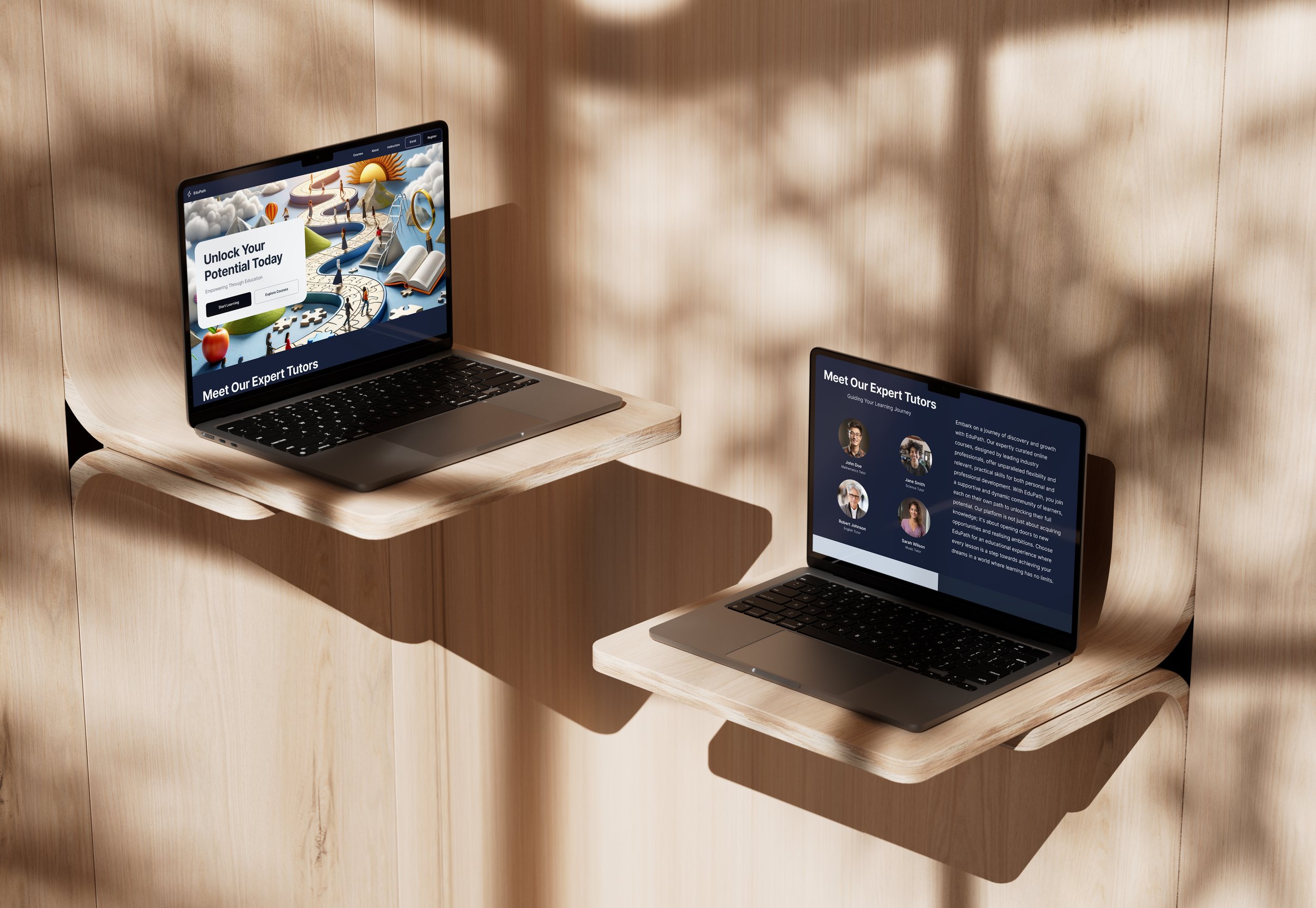
This one-pager for EduPath, designed by myself, is a harmonious blend of aesthetics and functionality. It guides learners on an inspiring educational journey. The choice of 'Inter' typography enhances readability on digital platforms, aligning with EduPath's ethos of accessibility and modernity. The primary color, a deep dark blue (#182138), embodies trust and knowledge, reinforcing EduPath's commitment to credible learning. The design narrative unfolds through intuitive interfaces and engaging visuals, reflecting the dynamic path of education. Each element, from the "Start Learning" button to the vibrant imagery, is meticulously chosen to craft an enriching user experience, symbolizing EduPath's dedication to empowering learners.
I meticulously crafted this one-pager for EduPath to encapsulate a holistic educational journey, one that not only informs but also inspires learners to embark on their quest for knowledge. My design philosophy revolves around the user's experience, ensuring the visual elements are not just aesthetically pleasing but also functional and motivational.
The typography choice of 'Inter' is deliberate. Known for its readability on digital screens, Inter offers a clean, modern sans-serif that marries well with the digital education platform's ethos. It is unobtrusive yet solid, making it perfect for the diverse range of users EduPath serves. The weight of the typeface is chosen to be accessible, ensuring legibility and ease of reading for all users, which is essential for an educational platform.
The primary colour, a deep, dark blue with the HEX code #182138, was chosen for its profound psychological impact. Blue, a colour associated with knowledge, trust, and stability, reinforces the reliability and credibility of EduPath. This specific shade of blue exudes a sense of depth and wisdom, resonating with the journey of learning and discovery that EduPath facilitates. It also provides an excellent contrast to the vibrant colours used in the imagery, which symbolises the diverse and dynamic paths of learning.
My design mirrors the path of education itself; it is not linear but a complex, interconnected labyrinth where each turn represents a new challenge or a nugget of knowledge. The imagery is carefully selected to depict this journey—books opening into new worlds, puzzle pieces representing the challenges of problem-solving, and paths leading to sunlit mountains signifying the pinnacles of academic success.
In creating this one-pager, I intended to tell a story, the story of every learner who sets out with EduPath. From the button "Start Learning" inviting users to take their first step, to showcasing "Expert Tutors" who guide them through their journey. The testimonials are strategically placed to provide social proof, whilst the "Your Learning Path" section is a personalised call-to-action, designed to propel prospective learners towards a future they aspire to.
The UI is designed to be intuitive, with clear, structured navigation paths that encourage exploration without overwhelming the user. The seamless flow from one section to the next mirrors the learning process—continuous, enriching, and always leading to a new horizon.
In essence, this design is a manifestation of EduPath's commitment to empowering learners. It is a visual testament to the platform's dedication to unlocking potential through education, where every element is a deliberate stitch in the fabric of a learner's educational tapestry.